Role
UX Design
Client
Academic Project
BoardU
BoardU
OVERVIEW.
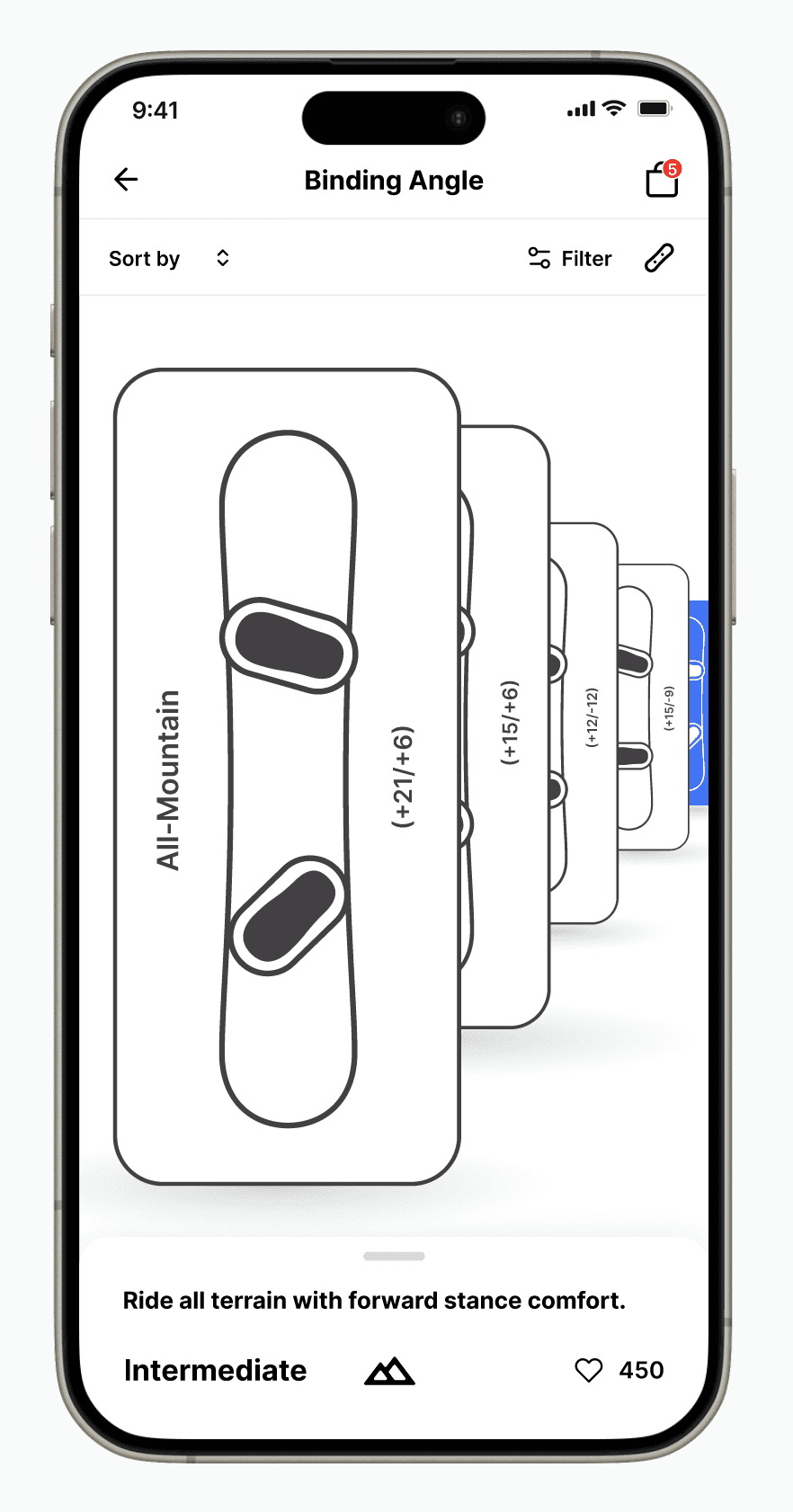
Snowboard binding angles are a technical concept that most beginners struggle to understand. BoardU is a personalized configurations app that visualizes binding angles based on the rider's experience level, making setup intuitive for beginners who don't know where to start.
THE PROBLEM.
Snowboard rental is unnecessarily complicated for beginners. Binding angles, stance width, and board flex ratings are technical terms that most first-time renters don't understand. The result is that beginners either guess, or rely entirely on whoever happens to be working that day.
Snowboard rental is unnecessarily complicated for beginners. Binding angles, stance width, and board flex ratings are technical terms that most first-time renters don't understand. The result is that beginners either guess, or rely entirely on whoever happens to be working that day.


OUTCOME.
Beginners no longer need to rely on rental shop staff to explain configurations, the system guides them through it independently.
Beginners no longer need to rely on rental shop staff to explain configurations, the system guides them through it independently.
LOW-FIDELITY MOCKUPS.
The wireframe maps the full rental flow: from entering rider information and experience level, through personalization of binding configuration, to the final recommended snowboard selection.
The wireframe maps the full rental flow: from entering rider information and experience level, through personalization of binding configuration, to the final recommended snowboard selection.


LOGO DESIGN.
LOGO DESIGN.
The logo concept started with a snowflake. The form evolved through iterations, each exploring how the interlocking shape could also reference community: people connected hand-in-hand in a circular ring. The geometry of a snowflake and the sense of a shared, connected experience.
The logo concept started with a snowflake. The form evolved through iterations, each exploring how the interlocking shape could also reference community: people connected hand-in-hand in a circular ring. The geometry of a snowflake and the sense of a shared, connected experience.

