Role
Visual Idendity
Project Type
Academic Project
Venice and
Its Lagoon
Venice and
Its Lagoon

OVERVIEW.
Venice and Its Lagoon is a visual identity project inspired by the UNESCO World Heritage Site and its unique relationship with water
Venice and Its Lagoon is a visual identity project inspired by the UNESCO World Heritage Site and its unique relationship with water
The project translates Venice’s cultural heritage, architecture, and lagoon landscape into a cohesive identity system designed for both digital and printed travel experiences.
BACKGROUND
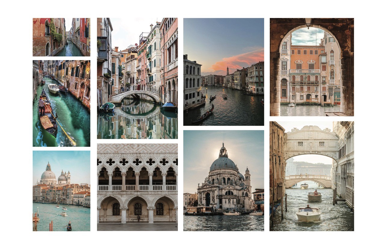
Venice has a rich visual history, but its identity is often represented through predictable imagery such as gondolas, masks, and historic buildings. The challenge was to create a contemporary visual language that still felt connected to the city’s heritage.
The identity also needed to remain recognizable and flexible across different applications, including websites, social media, travel materials, and printed collateral.
Venice has a rich visual history, but its identity is often represented through predictable imagery such as gondolas, masks, and historic buildings. The challenge was to create a contemporary visual language that still felt connected to the city’s heritage.
The identity also needed to remain recognizable and flexible across different applications, including websites, social media, travel materials, and printed collateral.
WHAT I DID.
I developed the project from initial research and concept exploration through the final visual identity and its applications.
The design direction was based on four characteristics of Venice: flowing, shimmering, romantic, and colorful. I explored custom typography and logo forms inspired by the movement of water, the curves of the lagoon, and the paths created by Venice’s canals.
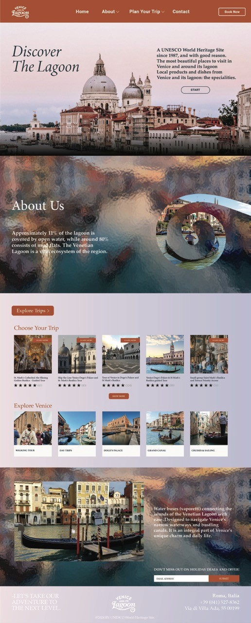
The final system included a primary logo, alternative logo treatments, typography, color direction, digital interfaces, social media applications, and travel collateral.
I developed the project from initial research and concept exploration through the final visual identity and its applications.
The design direction was based on four characteristics of Venice: flowing, shimmering, romantic, and colorful. I explored custom typography and logo forms inspired by the movement of water, the curves of the lagoon, and the paths created by Venice’s canals.
The final system included a primary logo, alternative logo treatments, typography, color direction, digital interfaces, social media applications, and travel collateral.


LOGO EXPLORATION.
I explored multiple typographic directions to understand how the identity could communicate movement, history, and place.
The early concepts experimented with curved letterforms, connected typography, and wave-like shapes. These studies helped establish a logo system that feels expressive while remaining recognizable across different formats and sizes.
I explored multiple typographic directions to understand how the identity could communicate movement, history, and place.
The early concepts experimented with curved letterforms, connected typography, and wave-like shapes. These studies helped establish a logo system that feels expressive while remaining recognizable across different formats and sizes.

